


Designing a high-quality banner can be the difference between catching the eye of potential customers or being overlooked in the crowd. With the right knowledge of resolution, color modes, file types, and other design elements, your banners can communicate your brand’s message effectively and professionally. This guide breaks down the key banner graphic design tips that help your banners stand out, attract attention, and enhance your branding.
1. Select the Right Resolution for Sharp and Professional Visuals
High-resolution images and graphics are the foundation of effective banner design. Low-resolution images appear pixelated or blurry, making your brand look unprofessional. Research shows that around 68% of consumers believe a business’s signage reflects the quality of its products or services, which underscores the importance of high-quality banner graphics in conveying professionalism.
Resolution and DPI for Banners
For optimal print quality, use 100-150 dpi for banners viewed from a short distance (e.g., store interiors) and 150 dpi or higher for large outdoor displays seen from a distance. Here’s a quick reference:
- 100% scale at 100-150 dpi for large-scale graphics
- 50% scale at 200 dpi
- 25% scale at 300 dpi
- 10% scale at 600-1200 dpi for fine details
For graphics optimization for banners, raster images (e.g., .JPG, .PSD) should be saved at a high resolution from the start, while vector images (.AI, .EPS) are inherently scalable without quality loss. This ensures that your design remains crisp whether it’s on a 2-foot sign or a 20-foot billboard.
2. Use High-Resolution, Print-Friendly Images
Using clear, impactful images significantly boosts engagement with your signage. Since the human brain processes images up to 60,000 times faster than text, incorporating high-resolution photos can enhance your banner’s appeal. However, avoid using low-resolution images from websites or social media, as these usually aren’t suitable for print and could compromise your banner’s quality.
High Resolution Image Sources
Instead, use images from high-resolution sources like stock photo sites or take your own photos using a quality camera. Banners are typically viewed from 4-10 feet away, so aim for a minimum of 150 ppi for images to ensure clarity. When choosing visuals, prioritize resolution, color accuracy, and relevance to your brand message.
3. Raster vs. Vector Graphics
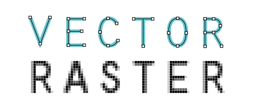
Raster Graphics
Raster images (e.g., .JPG, .PNG) are pixel-based and resolution-dependent. When scaled beyond their original size, they lose clarity, resulting in pixelation. These are best suited for photographs and complex visuals but require high resolution for large prints.
Vector Graphics
Vector graphics (e.g., .AI, .EPS, .SVG) use mathematical equations to represent shapes and lines, making them infinitely scalable without loss of quality. These graphics are ideal for logos and text-heavy banners that require resizing across different mediums, from business banners to promotional banners.
4. Select the Correct Color Mode for Your Project
Color plays a major role in branding and can influence a banner’s effectiveness. Studies show that color can improve comprehension by 73% and boost readership by up to 40%. However, the color mode you use will affect how colors appear on your printed banner.
RGB vs. CMYK
RGB (Red, Green, Blue) is best for screen-based design, while CMYK (Cyan, Magenta, Yellow, Black) is optimized for print. RGB colors are vibrant and suitable for digital use, but they don’t always translate accurately to print. In contrast, CMYK combines inks to achieve rich, true-to-life colors on paper or fabric.
To ensure color accuracy in custom banners or event banners, set your file to CMYK before printing. Programs like Adobe Illustrator and Photoshop allow easy switching between color modes, ensuring your colors are as bold in print as they appear on screen.
5. Understand File Types and Formats for Printing
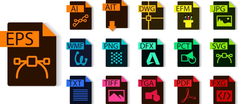
The file format you choose will impact the quality and usability of your banner design. Banner design specifications often recommend vector files for logos and other graphic elements that need to be scaled. Here’s a breakdown of the best file types for print:
- PDF: Ideal for printing and the most universal format for high-quality, scalable graphics.
- EPS: Perfect for logos and other vector-based graphics, as it maintains clarity regardless of size.
- AI: Adobe Illustrator files are great for vector graphics and detailed designs.
- JPG and TIFF: These formats are suitable for raster images at high resolution (300 dpi).
For file preparation, convert all text to outlines and paths, which prevents font substitution errors when files are printed. If using vector elements in your fabric banners or other signage, remember that EPS files maintain image quality and allow seamless scaling.
Additional Design Tips for Effective Banner Creation
Beyond the technical specifications, here are some extra design tips that can further enhance the effectiveness of your advertising banners:
- Margins and Bleed: Ensure a 2-inch margin on all sides of your banner to prevent critical design elements from being cut off during the trimming process.
- Font Size and Readability: As a rule, use one-inch tall letters for every 25 feet of viewing distance. This sizing ensures readability and enhances engagement with your banner.
- File Prep and Submission: When submitting files, ensure they’re in PDF or EPS format for best print quality. Avoid low-resolution formats like GIF or web-based JPEGs, which are optimized for screens but unsuitable for print.
Understand DPI and Print Clarity for Large Banners
DPI (dots per inch) directly impacts the clarity of your printed design. For resolution tips for large banners, consider the following when designing for print:
- Small and medium-sized banners (viewed up close): 150-300 dpi is recommended for clear text and detailed graphics.
- Large-format banners (viewed from a distance): 100-150 dpi is often sufficient, especially for banners that will be seen from 10 feet away or more.
Lower dpi can still result in clear images if the viewing distance is far enough. As a rule, prioritize high dpi for small, detailed graphics and adjust accordingly for larger signs.
Final Considerations for High-Impact Banners
Well-designed banners act as a powerful marketing tool, helping your brand capture attention and convey messages clearly. Approximately 72% of Americans report that product packaging and signage influence their purchase decisions, highlighting the importance of quality banner design. Here are some final tips:
- Design with Scannability in Mind: Simplified designs and easy-to-read fonts make banners more readable and scannable, encouraging quick comprehension.
- Outline All Text and Fonts: Converting text to outlines or curves ensures that fonts are preserved correctly, which is essential when printing in different formats.
- Include Contact Information and Calls to Action: Use brief, impactful text to drive engagement, encouraging viewers to contact you or visit your website.
Incorporating these specifications will result in banners that are visually appealing, professional, and impactful. From fabric banners to business banners, the quality of your graphics speaks to the quality of your brand. Following these banner graphic design tips ensures that each sign resonates with your audience and leaves a lasting impression.
By understanding these design fundamentals, you’re well-equipped to create custom banners that are not only eye-catching but also convey a polished and professional look, helping you capture attention and drive action effectively.
References:
- FedEx Office Survey on signage quality perceptions: FedEx
- Color research on consumer perception: Psychology of Colors in Marketing and Branding – Neil Patel
Design software guides: Adobe Illustrator Official Site