


When you are meeting someone at a professional event, a strong handshake might be the first impression; however, it is the business card you leave behind that helps people remember you. In a world of digital connections, business cards still play a huge role in face-to-face networking. These simple, pocket-sized tools carry your name, brand, and identity wherever they go. So how do you make sure your card doesn’t get lost in the pile? The secret lies in thoughtful design. Let’s look at some simple and effective ways to design business cards that help you stand out.

Keep It Clear and Easy to Read
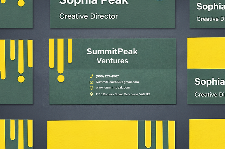
Your business card should never make someone squint. Choose clean fonts that are easy to read and keep your layout simple. Make sure there is enough space between elements like your name, job title, phone number, and email.
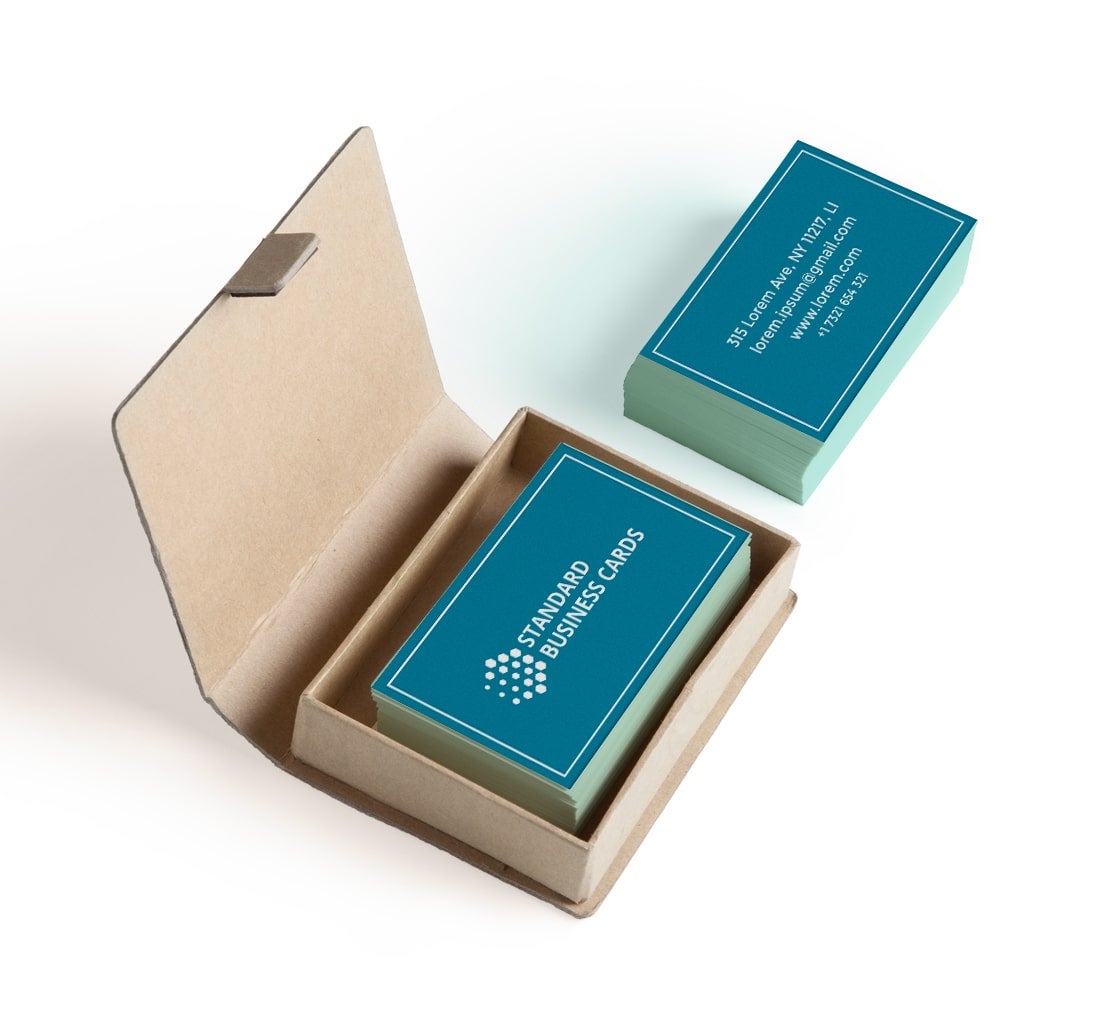
Some people try to stuff too much information onto one card. Resist the urge. Just stick to what is truly necessary. If your card feels too crowded, it might be worth switching to folded business cards so you can add more details without cluttering the front.
Stick to One or Two Fonts
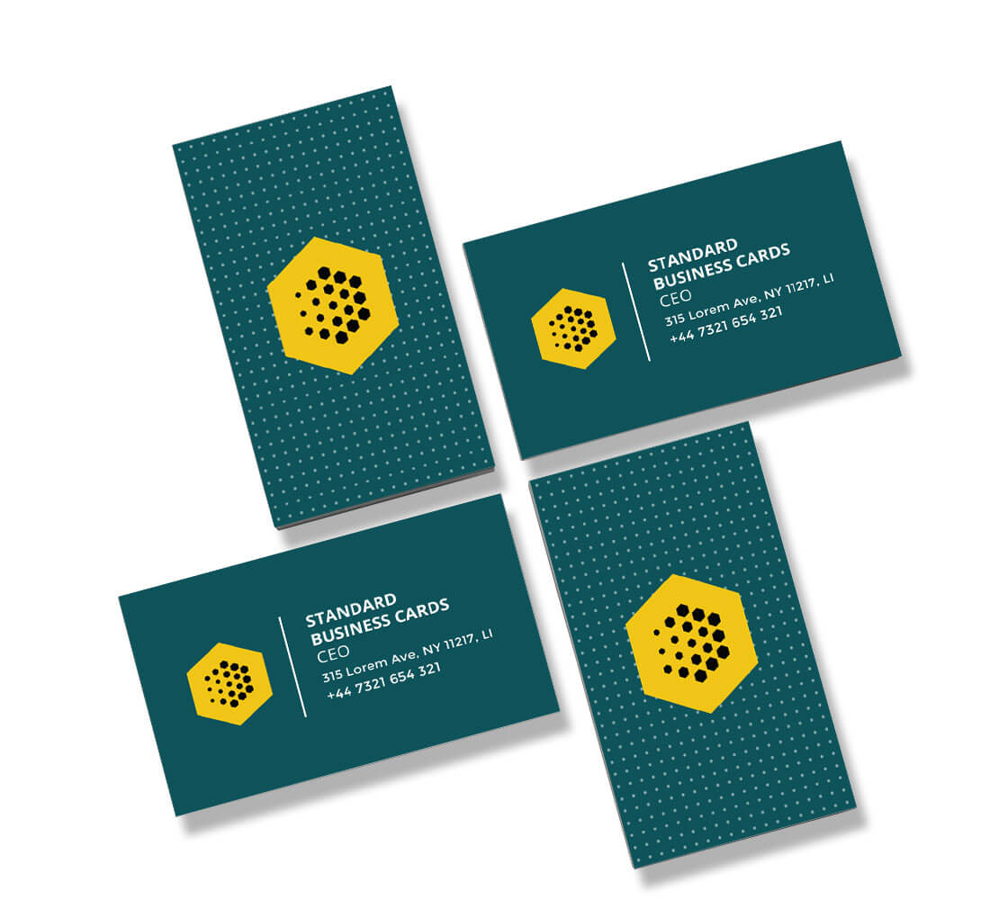
Mixing too many fonts can make your card look messy. Use just one for headings and another for body text. Make sure both fonts look good together and are consistent with your brand style. If your business has a logo or signature font, use that on the card to keep things aligned.
This consistency helps with effective business card designs for branding, allowing your card to feel like a natural part of your entire visual identity.
Use Color Wisely
Color can be your best friend if used right. A bright accent color can help your name or logo stand out, while neutral tones make the card look clean and professional. Stick to your brand colors if you have them. That helps people associate your card with your business right away.
It is tempting to go for flashy neon shades, but they don’t work for every industry. Pick tones that reflect your profession and tone of work. For example, soft pastels may work great for a design consultant, while deep blue or grey might suit a finance professional better.
Think Beyond the Standard Shape

Want to be remembered? Try something different with the shape or layout of your card. Square business cards are a good option if you want your design to feel modern and fresh. Their unusual shape makes them stand out instantly among traditional cards. But don’t go too wild. You want your card to still fit in a wallet or cardholder. Unusual shapes are great, but functionality should always come first.
Add a Little Something Extra
Sometimes, the smallest touches make the biggest difference. You could go for raised text, a matte finish, or spot UV for a glossy detail. These small touches can make your card feel more professional and give it that tactile quality people remember.
Want to go one step further? Include a QR code that links to your portfolio, LinkedIn page, or company website. It keeps the card clean but offers more information for anyone who wants it.
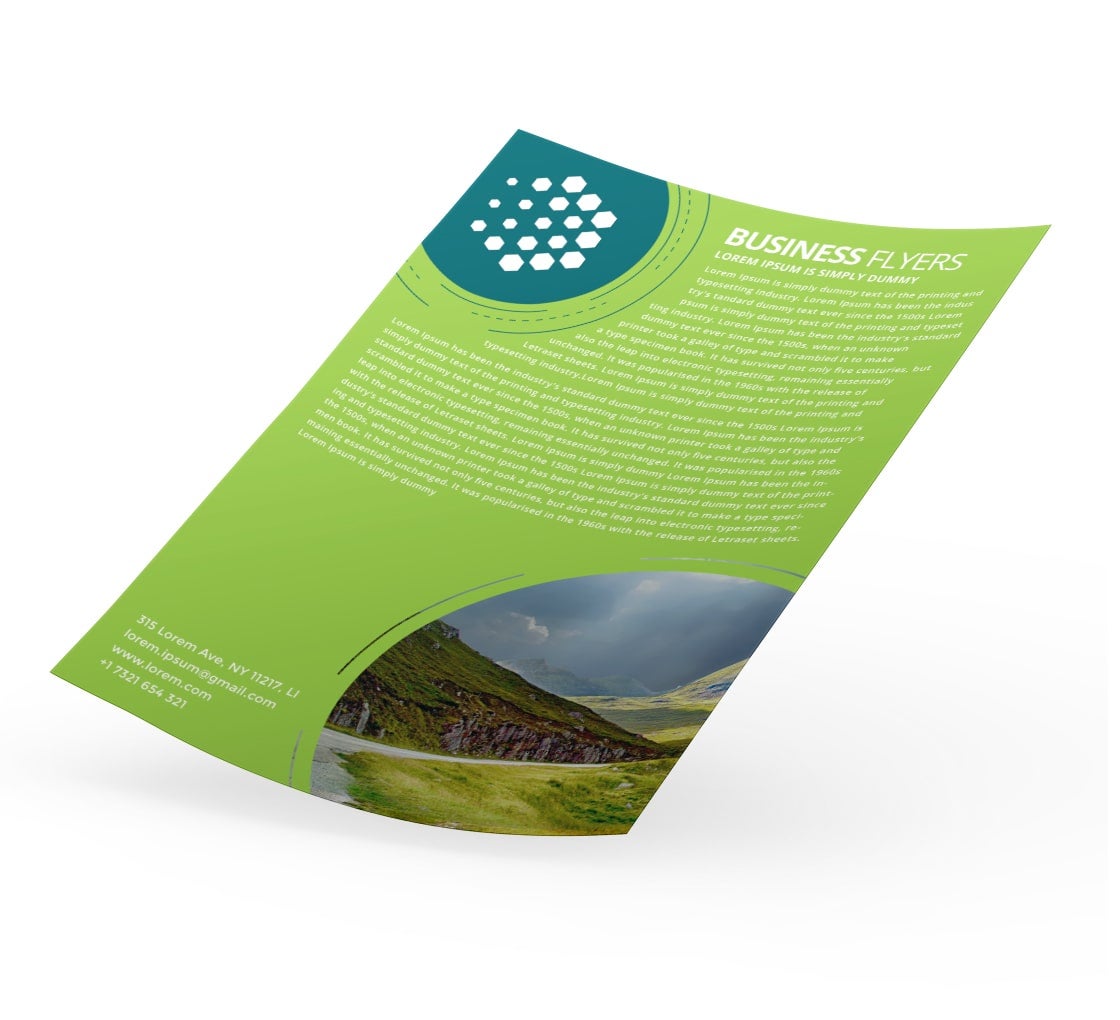
If you are offering a service or a deal, you could pair your card with business flyers during events. Flyers give space to talk about your services in more detail, while your card keeps the conversation going after the event is over.
Quality Matters
No matter how good your design is, if the paper feels cheap, it reflects badly on your brand. Thicker paper stocks feel sturdier and leave a better impression. The card should hold up well even after being carried around in a wallet or bag.
This small upgrade goes a long way in showing that you care about quality, and that detail doesn’t go unnoticed during networking.
Make it Personal
If you want to build real connections, don’t settle for a generic look. Choose custom business cards to boost networking success. These let you control every element including colors, fonts, layout, finish, and even material. You can make sure the card reflects your unique voice and professional identity.
A custom card tells people you are not just another name in the stack. You’ve thought this through, and you value interaction.
Try a Design with More Space
If your work involves multiple skills, contact numbers, or even different languages, a double-sided layout or a folded card can help. With more space, you can split your details in a way that feels balanced and easier to read. If your card feels too tight, it can look rushed. A layout that breathes feels more polished, and that makes a lasting impression. Try to design business cards with space in mind, not just information.
Design with Strategy, Not Just Style
Many people think a beautiful card is enough. But good looks without a purpose won’t help you connect better. Look for designs that are not only nice to look at but also useful in real conversations.
You are aiming for the best business card tips for professionals, and that includes thinking about where and how the card will be used. For example, a minimalist design might work well in corporate circles, while creative fields might call for bold colors and playful elements.
If you are still unsure of how to design business cards for networking, just remember one thing: your goal is to help someone recall who you are, what you do, and how they can reach you.
Conclusion
A card is not just a small piece of paper. It is a way to stay in someone’s mind after a quick chat at an event, a conference, or even a coffee shop. The right design can improve networking with business cards by making it easier for people to remember who you are and what you do. Always carry a few cards with you. You never know when you’ll meet someone who might need your service or want to connect further.