Banners are an effective way to get an audience to notice your business and make them interested in your offerings. When used correctly, these products can revolutionize your brand building initiatives. However, many businesses fail to use the right design techniques that will attract an audience.
Keep reading to see what design techniques will bring your brand into focus for your target market.
Eye-Catching Contrast
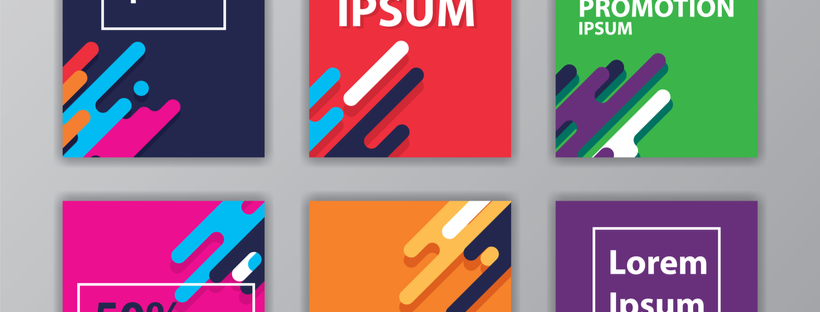
Contrast is one of the most important concepts when designing banners because it enhances the most important elements of your design. While bright colors help you attract attention quickly, creating a contrast of colors will make your banner pop.
Eye-catching contrast happens when two different design elements are in opposition to each other, such as thick and thin, black and white, modern and traditional, and more. More often than not, the best banner design ideas consist of two simple colors that contrast well (one for text and the other for the background). A high contrast can help guide the audience’s eyes to the most critical elements of your banner design.
Choose Your Focal Point
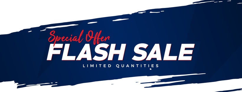
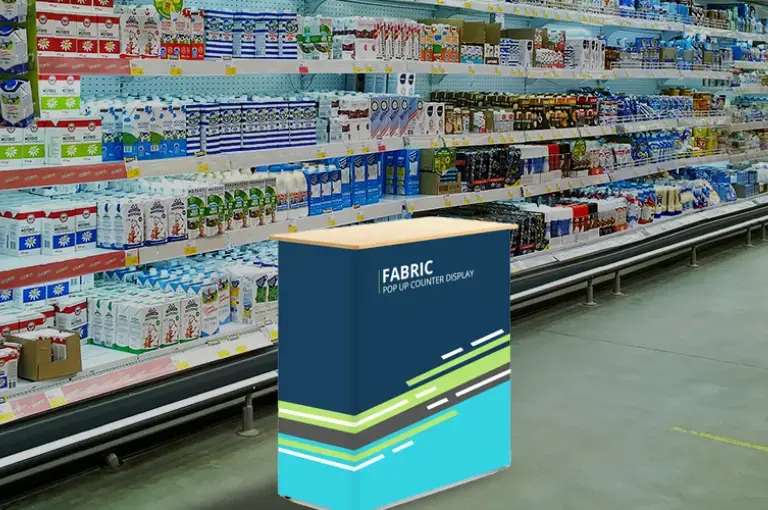
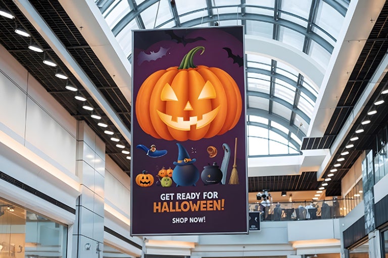
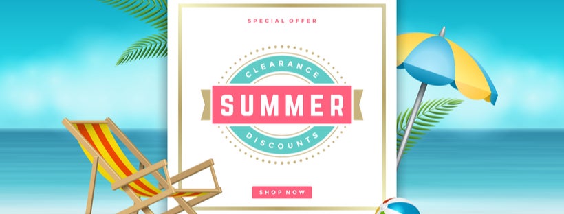
When you design banners, especially large ones, designate a clear focal point for the most important part of your message. This placement ensures that your audience’s eyes are drawn to key messaging so they can gather the essential information. The focal point here can either be an image, a word, a logo, or a line of text/ like the word “SALE” or “50% Off”.
There are multiple ways you can put the spotlight on a certain portion of your banner. For instance, you can bold, underline, highlight, or capitalize the text to draw the audience to a particular word or line. Another way is to simply make the emphasized portion (text, word, or image) appear larger relative to other elements on the banner. The idea is to use your focal point as the hook.
Get the Most out of Your Graphics
Since most banners aim to attract audience attention, often from a distance, it’s important to make sure to draw the focus of passersby to your banner. While elements such as color, sizing, and typography are important, another important aspect is the use of high-quality graphic images.
Making the most of graphics ensures that images remain the focal point of your banner and promote a positive representation of your brand. When you design your banners, choose high-resolution images, not screenshots, small web images, etc. Proper graphic files create perfect print reproductions for banners, custom flags, canopies, and more.
How to Highlight Key Information
Take a closer look at what message you want to communicate and how you can highlight that key information with these marketing materials. Your banner should be short and to the point, effortlessly communicating key information quickly with any person who sees it.
You can do this by carefully considering the purpose of your banner and making sure that it isn’t overcrowded. Choose a design that shows off your branding with a logo along with a few words that offer an overview of the products or services that your business provides. Convey important information with eye-popping visuals and use minimal words to encourage your audience to take action. Here, simplicity is key to success.
Colors Choice
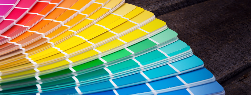
Colors and fonts are also important elements for your banner design. Colors are the first thing that an audience notices and different colors have different associations. It’s important to consider what types of emotions you want to evoke with the right choice of colors. For instance, red triggers emotions that are powerful, green is generally associated with nature and growth as well as freshness, whereas orange is associated with warmth, courage, and energy.
Bring Focus with Fonts
Similarly, it’s best to choose clean fonts for your banners that are legible from afar. To achieve a clean look, make sure to stick to one or two font styles, as a mix of different typefaces can distract the audience from the message. Also, if you’re using two fonts, make sure they are in the same font family. For instance, Arial Classic, Arial Narrow, and Arial Bold fonts pair well together.
Readability should be another consideration when choosing font size. Whether it’s a standing banner design kept at a trade show or a window banner used in your store, your font size should always be large.
Placement and Merchandising
Another important thing you should consider before making any design-related decision is the intended placement of your banner. Ideally, the color scheme of your banner needs to highly contrast its placement.
In terms of visual merchandising, make sure to be clear and concise in order to ensure that customers will be able to easily read and understand your banner in less than five seconds. You can also use headlines, text, and a call to action to tell your audience precisely what you want them to do. If you incorporate all of these design considerations, you can easily bring your brand into focus with high-quality, custom banners.