When you have an online business, you might have different landing pages to engage your audience. Your digital marketing team will design certain pages to sell your product, promote a new offer or share essential information. This information can be distilled to fit your offline marketing materials too. The easiest way to persuade your target audience to action is with captivating images and exciting text prompts.
These prompts are known as a call-to-action. You can put them anywhere on your website, email advertisements, in-store signs, or custom banners for your storefront to get leads and convert them into sales. The way you conceptualize and place calls-to-action (CTAs) can make a significant difference in your online sales conversions.
Use the Right Words

The whole idea of using CTAs is to encourage visitors to click on them. If they cannot generate the necessary interest, using CTAs is of no use. It’s the reason phrasing them right is crucial to get the desirable results.
The idea is to tailor the information as per the visitor’s position in the buying cycle. Let them know what they can expect when they click on the CTA. Using clear words will help them avoid clicking on the wrong CTAs and enhance their overall online or offline shopping experience.
Choose a Strong Action Verb
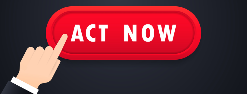
One easy tip you can follow is to use definitive CTA phrases or command verbs. It will direct your visitors to take the desired action. For instance, instead of saying, “Are you ready to join?” try using “Join now!”.
As human beings, we are attuned to following orders. Moreover, we are used to scanning the Internet and looking for CTAs to get the desired information. Action verbs help you in giving clear and concise information in order to take the next step.
Tap Into Emotional Appeal
Your CTA should create emotional appeal to encourage your visitors to take action. Fear is one of the most used emotions in CTAs. Although, the idea here is not to scare your visitors away. Instead, you want to tap into something they already know.
You can also provide them a sense of inclusion by saying, “Join Our Team” It will give your visitors confidence that they are doing the right thing, and that you are helping them take part in their community.
If you want to give users a sense of urgency for their purchasing decisions, create a sense of scarcity with words that create fear of missing out. For these CTAs, focus on the temporal context with words like “Claim Now” or “Reserve Final Spot”.
Make It Worth Their While

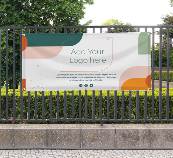
In offline advertising, you pay special attention to banners, decals, brochures, and flags. Your CTAs demand an equal level of focus for offline and online advertising. If you are trying to create a subscriber base or make a directory, you would want your visitors to sign up and possibly share their personal details like an email address or phone number. If you want to attract new in-store visitors, you need to properly incentivize them. Your CTA should convince offline and online users that following your CTA will be worth their while.
Instead of using generic CTAs like “Click here” or “Contact us,” try to use “Start your free trial” or “Download free e-book now.”
Get Creative With CTA Design
Your CTAs should be easy to find on the website and should appear clickable. Your designer can add 3D effects, gradients, or rounded edges to suit your UI design. You can also use graphics on the button to make it appealing. Secondly, choose the right size to make your CTA buttons stand out on the website. The color or your CTA should always contrast with the background color of your pages to make them easily noticeable.
These principles apply to CTAs for print materials like banners too. Highlight your CTAs with bold fonts and directional prompts like arrows.
Apart from these ideas, their placement can also make a significant difference. It should fit into the user’s journey as they traverse your website.
Get Creative
It is essential to stay on-brand with your CTAs, but they do not have to be boring. For instance, there are several ways to say “Buy Now” instead of using these exact words. If you are selling lamps, your CTA can read “Bring Light To Your House.” To schedule an appointment, the CTA can say “Pick a Time” instead of “Book an Appointment.”
Create a Sense of Urgency

Nothing works like creating a sense of urgency. However, it works only when people are getting something they will actually want to use. To use this tactic, give a limited-time offer that your customers will lose if they don’t buy now.
Giving them a deadline, showing the scarcity, or creating FOMO are a few other ways to tap into the fear of your visitors and inspire them to take action.
Make It Easy to Read

Finally, your CTA text should be easy to read. The button should be large enough for the text to stand out. Make sure that the button text does not exceed five-six words, or it’ll look too crowded.
Final Word
With effective CTAs, you can enhance your customers’ experience as they visit your website. Moreover, you can also increase the chance of converting leads and generating revenue.

 Posted in